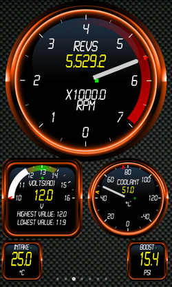
Themes
Themes can be created for Torque and used in the app, they can also be uploaded to the theme server so that others can enjoy the theme
There are several parts to a theme which are contained within a .zip file:
- properties.txt - This references various settings that can be adjusted, from fonts, to needle size, colours, and the position of 'ticks' within the dial surfaces
- background.jpg - This is the main background image that is shown on the screen
- dial_background.png - this is the background used for circular dials
- display_background.png - this is the background used for square displays.
You can test your own themes by extracting the contents of your .zip file to the /.torque/themeDir/ folder on your SD card, then restarting Torque. An example of a theme file can be found here: [vwmk7sport.zip] and a more basic one here: [blue.zip] and a more advanced one here: [leather2.zip]
As of 1.5.32(full version) the dial_background.png and display_background.png are further expanded, so that you can now have custom backgrounds depending on the PID (sensor) the display is showing, so for an RPM dial display that you may wish to show a different background for, you would include a file named as:
dial_background_0c.png
The '0c' is the PID of the display you want that background to reference, for Speed, it's '0d' (0x0D in hex), and fuel pressure would be '0a'. There is a list of what these codes are on the sensors list page PluginDocumentation
You can also set the font type - include a file 'font.ttf' inside the theme zip and the app will automatically use it when the theme is selected.
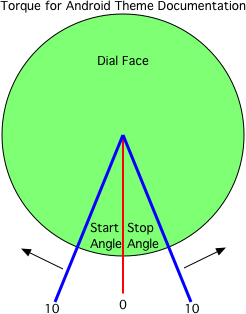
Dial stop and dial start angles are offsets from the bottom of the dial. To make a dial look like a more conventional vehicle speedometer dial you could put: dialStartAngle_0d=45 dialStopAngle_0d=45
'0d' is the PID for the speedometer. You can find the list of PIDs here: PluginDocumentation
Dials which use the start and stop angles cannot show negative numbers on the dial itself (but the number value will still be visible on the actual dial face). This limitation will probably be removed in future updates
Properties.txt file format
The properties file is a simply key=value file that can be edited in a text editor. It allows you to control various things like colours, and positioning of dial elements.
- dialTickInnerRadius=<value> - these adjust the inner and outer 'tick' marks around the dial
- dialTickOuterRadius=<value>
- dialStartAngle_<pid>=<value> -the dial start and stop angle as described in the image to the right for one PID (the PID is in lowercase HEX), so 0d is speed
- dialStopAngle_<pid>=<value>
- globalDialStartAngle=<value> - The global start and stop angles for all dials (see the image on the right)
- globalDialStopAngle=<value>
- dialNeedleLength=<value> - the length of the meter needle, if not using a bitmap
- dialNeedleOffset=<value> - If using a bitmap for the needle, this controls the pivot offset
- dialNeedleSizeRatio=<value>- this controls the size of the needle inside the size of the dial. multiplier, default of '1'. '0.5' would be half size
- renameTitle_<pid>=<different text> - renames a dial text. Will override the users settings and will be then saved with the dial permanently. try to avoid use if possible
- hideScaleLabels=<false|true> - hides the 'x1000' scale labels commonly found on things like the RPM dial
- forceRPMScale=<value> - Forces the RPM scale (eg: 1000, 100, etc)
- textRadius_<pid>=<multipler - eg: 1.5> - controls the dial text distance from centre of dial.
- globalTextRadius=<multipler - eg: 1.5> - global option for all dials to control text placement
- dialMeterValueFontScale=<value> - changes the 'value' font size in the meter style gauges. Multiplier, default '1'
- dialNeedleValueFontScale=<value> - changes the 'value' font size in needle style gauges
- dialNeedleTitleTextOffset=<number> - controls vertical offset of text on needle type dials
- dialMeterTitleTextOffset=<number> - controls vertical offset of text on meter type dials
- dialNeedleValueTextOffset= - controls vertical offset of text on dials on needle type dials
- dialMeterValueTextOffset= - controls vertical offset of text on dials on meter type dials
- dialNeedleUnitTextOffset= - controls vertical offset of text on dials on needle type dials
- dialMeterUnitTextOffset= - controls vertical offset of text on dials on meter type dials
- dialNeedleScaleTextOffset= - controls vertical offset of text on dials on needle type dials
- dialMeterScaleTextOffset= - controls vertical offset of text on dials on meter type dials
- dialMeterValueThickness=<value> - default '1', Changes the meter value indicator thickness
- dialMeterValueOuterRadius=<value> default '1', Changes how far from the centre of the dial the 'round' value indicator is
- displayTickColour=<colour - can be HTML notation #rrggbb, #aarrggbb or 'green'>
- displayTextTitleColour=<colour, as described above>
- displayTextValueColour=<colour, as described above>
- displayIndicatorColour=<colour, as described above> (dial needle colour, and/or other 'indicator' colour)
- graphLineColour=<colour as described above> - can also be graphLineColour_{pid}=<colour>
- updateFlasherColour=<colour, as described above> - this changes the colour of the little flashing square when the dial gets new data
- dialNeedleColour=<colour, as above> - The display needle colour
- backgroundScrolls=<true|false> - turns off scrolling of the background
- font=<string font, as known in android, eg: 'sans-serif'> (you can also use a .ttf file - see above)
- globalFontScale=<number> (multiplier, scales up or down the font size, default '1')
- globalTitleTextCurved=<0|1> - 1 curves the text around the top of the dial
- dialStepsDivisor=<number> - force this many 'subticks' (when used with tick style 1)
- dialTickStyle=<0|1> - 1 changes the default visual 'ticks' style
- hideTicks_<pid>=<true | false> - Hide the tick marks on dials
- globalHideTicks=<true | false> - Global option for hiding tick marks on all dials
- showUpdateFlasher=<true | false> - shows/hides the update flasher
Logo options
A logo can now be placed on the screen. To enable this simply name the logo as 'logo.png' and include it in your theme - you can then fine tune the position with the following options:
- logoHorizontalOffset=<value> - Horizontal position of logo.png, in %age, so "50" would be halfway.
- logoVerticalOffset=<value> - Vertical position of logo.png, in %age, so "50" would be halfway.
Fonts
The font= directive is the android font - bear in mind that different devices may not contain the font you are using so this really should just stick to the default android fonts.
The file "font.ttf" (if present in the theme) should override the font= directive
The file "valueFont.ttf" (if present in the theme) will be used for display values instead of font.ttf if present
If you have created a theme and want to share it, [let me know] and I'll add it to the theme server!
NB: the recent changes to themes affect round dial type only. This will be rolled out to the square dial types, and the lite versions of the app(as well as plugins) soon.

